Showing posts with label creme. Show all posts

Thursday, March 1, 2012

Chanel May — Swatch & Review

Wow, all of February escaped without a single blog post! I wish I'd posted more, but my new circumstances have prevented me. I'll tell you all about it at the end of this post!

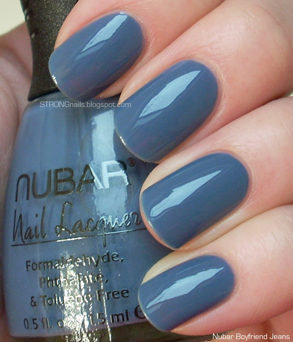
So I've noticed that I don't really have all that many pinks in my stash, which is part of why I decided to get Chanel Le Vernis in May #535. This is of course one of the trio of nail polishes from the Harmonie de Printemps Spring 2012 makeup collection. Another reason I decided to get May is because I love the whole collection and I wanted to have the complete set. Although this pink is not too out of the ordinary, I don't have anything to compare it to since I have relatively few pinks.

May is a very neutral shade. Sometimes it seems to lean warm, and other times it seems more on the cool end of the spectrum. I think it's a shade that would suit most skin tones. I used two coats for this swatch. The formula is smooth and easy to apply, with a slightly squishy quality although I wouldn't call it a jelly. Even if May is a fairly ordinary pink, I'm quite pleased to own it as it's a well made polish.


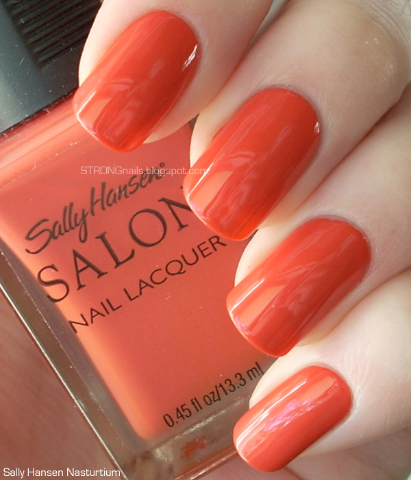
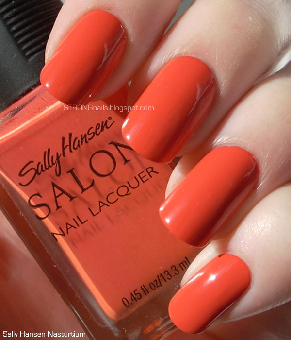
I took a picture with all three polish colors from the Spring collection. I just love how April, May and June all look together.


Ok I promised to explain my long absence, so I shall! About a month ago I started working full time in a nail salon. Yes, I'm in fact a licensed nail tech! I've had my license for a little over a year, but this is my first job in that capacity, so I didn't think it was worth mentioning until I really "earned" the title by working as a nail tech. Painting your own nails, friends' nails, or even the nails of the other ladies in my nail tech class is entirely different from giving full manicures and pedicures to paying customers in the busy salon. It's a tough job which makes me very tired at the end of the day, but I also love it and I'm very lucky that I have genuinely wonderful coworkers.

Since I always get home after the sun has already gone down, I haven't been able to make any swatches. So, it's time for me to get some of those super bright daylight lamps and a light box so I can take some photos in the evening. I'm slowly getting used to the busy work day, and building up stamina so I'm not quite so enormously exhausted when I get home. I hope I'll be able to get back to posting at least once or twice a week! =)

Monday, January 23, 2012

Revlon Bewitching VS Chanel April

Hello everyone! My January class is all finished, and I hope to get back to more blogging finally.

I have swatches of a new Revlon polish called Bewitching, which is not to be confused with the classic Revlon shade Bewitching Bordeaux. Bewitching is a lovely rose red creme that was released for this spring. The formula is just right, and applies smoothly. I used two coats for total opacity.


The moment I spotted Bewitching in the display it reminded me of Chanel April (full review here) and I wondered if I'd found the latest drugstore dupe. However, once I had the bottles side by side it was obvious they were different shades. You can see April is a much more muted rose, with more brown in it.


I think Bewitching is a perfect springtime version of red. It really reminds me of flowers.

Friday, January 6, 2012

L'Oréal Club Prive — Swatch, Review & Comparison

A couple days ago I came across two untouched displays of L'Oréal's new line of Colour Riche nail polishes. I picked out only two for my introduction to the line, and it was hard to decide among all the great colors. They had the usual range of classic reds and pinks, but plenty of more trendy and chic colors as well. I'm happy to report that these polishes have the same fantastic flat but not mop-like brush as L'Oréal's previous line of polishes. This is a huge selling point for me as it's one of my favorite brushes from any brand. I'll be going back for more soon I'm sure!

This shade is #105 Club Prive. I'm assuming "prive" is a typo of privé, so the name translates from French to "private club". It's a lovely aqua or turquoise creme. I needed three coats for even coverage and opacity, but the formula was very easy to work with. It had none of the goopy-ness you sometimes get with pastel colors. It also dried fairly quickly as well.


This shade is very similar to China Glaze For Audrey, but if you're a well-trained nail fanatic you can certainly tell the difference. For Audrey is a degree more blue. In this comparison shot Club Prive is painted on my index and ring finger.


I found these at CVS for about $6. Has anyone else spotted these new polishes? Did you get any?

Monday, December 19, 2011

Chanel April — Swatches, Review & Comparison

After a few days of wearing Chanel June, I had to go back to SoHo to pick up April. Something about the color wouldn't let me stop thinking about it. (Sounds insane, but I know my fellow polish fanatics understand!) So back to the boutique I went. As soon as I painted my nails with this lovely polish, I was very glad I went back for it.

April is a soft burgundy or garnet. It has a hint of brown and is slightly muted, but still a very rich color. I think it's quite sophisticated!


This shot under artificial light shows off the slightly muted tones of the color.


I don't have a lot of colors in this family in my stash. I had nothing that looked like it would be close at all, but I made a comparison anyway in case anyone finds it helpful. On my index finger is OPI Manicurist of Seville, and on my ring finger is Zoya Sofia.


Application for this polish is so smooth and dreamy. It's seriously flawless and easy. Two coats are all I needed for saturated color and a glossy finish. I've been wearing it for four days and it's holding up beautifully with only very minimal tipwear (normal for any polish). I have a feeling this polish is going to be one of my all-time favorites.

Like May and June, April is available on Chanel's website for $25.

Sunday, December 18, 2011

Chanel June — Swatches, Review & Comparison

I'm finally back from New York City! I am not yet skilled enough at blogging to have things scheduled to post when I go away. I hope someday soon I'll get it together for that so there won't be such long pauses.

Whenever I go to New York I can't resist making a trip to the Chanel boutique in SoHo.  This time I even went twice, and the first time I came back with June (#539). June is one of the three nail colors from Chanel's Spring 2012 Harmonie de Printemps collection. In French this means Harmony of Spring, or Springtime Harmony. The three nail colors in this collection really do look harmonious together. (On my second visit to the SoHo boutique I came back with April (#533) which I will post about tomorrow.)

June is a pastel tangerine/peach/apricot color. The formula is what really makes this color so nice. It's a cross between a jelly and a creme. I used three coats for total opacity. The first time I applied this color I did a full manicure on rather long nails. It wasn't overly difficult to control the polish, but I found it easier on shorter nails. This polish has a very nice consistency and isn't streaky at all. I think Chanel did a great job on the formula for this one. It has a very nice, glossy finish.


I took a picture after just one coat to show how nicely this polish applies. You can also see the jelly-ness of it. You can also see that the color becomes more intense after two more coats.


I compared June to two polishes in my collection: China Glaze Peachy Keen and Essie Tart Deco. Obviously Peachy Keen is a much closer match than Tart Deco. Peachy Keen is definitely quite similar, but it lacks the lovely jelly texture of June. It's also streakier and chalkier, and leans a tiny bit more pink. Tart Deco of course is much pinker.


I think this shot under artificial light shows the difference between Peachy Keen and June more obviously.


I wore June as a full manicure for about four days and experienced no chipping at all. It still looked glossy and perfect.

June, along with April and May, is currently up on the Chanel website for $25. I love the convenience of shopping online, but for me half the fun is making a purchase in the boutique where you get to experience the perfect, smooth customer service.

Saturday, November 26, 2011

Zoya Avery — Feel Collection Winter 2011

(UPDATE: Here's my review of the entire collection, with all the swatches together.)

At last, the final installment in the Zoya Feel Collection! Here is Avery, a pale camel creme. Unexpectedly, I found this color was the easiest to apply out of the whole collection. It was thin but not watery, and flowed well. I used two coats and no topcoat for this swatch. It also dries fairly quickly and is shiny. Tomorrow I'll have a full collection comparison and review post!


Thursday, November 24, 2011

Zoya Kennedy — Feel Collection Winter 2011

(UPDATE: Here's my review of the entire collection, with all the swatches together.)

Happy Thanksgiving!

I have just a couple minutes before I have to run off to visit family for the day's fun! Here's Zoya Kennedy from the Feel collection. It's a dusty pastel rose, and is vying with Kendal for the spot as my favorite shade from this collection.


Application was like the rest, slightly tricky but smooth considering it's a pastel. Two coats and no topcoat in this picture.

Wednesday, November 23, 2011

Zoya Kendal — Feel Collection Winter 2011

(UPDATE: Here's my review of the entire collection, with all the swatches together.)

Do you think Zoya Kendal might be pink enough to qualify for Pink Wednesday? I can't decide if this pastel creme leans more lavender than pink. Next to Megan, it's definitely a shade pinker.


This is probably my favorite color from the collection. I thought the application was a tiny bit easier than the first four. Once again, it only needs two coats and the final result is smooth and shiny with no streaks or unevenness.

Tuesday, November 22, 2011

Zoya Megan — Feel Collection Winter 2011

(UPDATE: Here's my review of the entire collection, with all the swatches together.)

Hey there! Continuing with the Feel Collection, here's Zoya Megan. I'm finding this color tough to describe. It's very delicate, light gray with a hint of lavender. (I guess I just described it!)


Like the other polishes in this collection, Megan needs two coats for opacity. I recommend same technique of one thin coat and a second thicker coat for applying this color. Even though these pastels can be a little annoying and thick, I'm becoming more and more impressed with this collection because despite any application issues, you really can get this polish right in two coats. If you have any leftover lumpiness, the topcoat will smooth everything out.

Monday, November 21, 2011

Zoya Carey — Feel Collection Winter 2011

(UPDATE: Here's my review of the entire collection, with all the swatches together.)

Here's the next color from the Zoya Feel Collection, a pale gray creme called Carey. This is a fairly neutral gray, although I would say it leans a tiny bit to the cool side.


Like Kristen, this polish only needs two coats for complete opacity. Since it's a pale color, the formula is a little tricky to work with. I found it was best to make the first coat thin, and to not worry about how streaky the coverage was. Wait at least two minutes, then make the second coat a little thicker. It also helps to apply the color in as few brush strokes as possible.

Sunday, November 20, 2011

Zoya Kristen — Feel Collection Winter 2011

(UPDATE: Here's my review of the entire collection, with all the swatches together.)

I got the Feel collection in the mail yesterday. I rarely buy full collections, but I was totally drawn into this one by the promo picture. I do not regret my purchase, each color is lovely! First I'll show you Zoya Kristen, which is a slightly blue-tinged pale gray creme.


The formula for this color, and this whole collection, is simultaneously impressive and frustrating. I'm super impressed that it only took two coats to get full coverage and opacity. This is pretty rare for such pale colors. The texture is chalky and tricky to work with, but still a major improvement over pastel colors that came out a couple years ago. Only two coats! I don't think I've ever encountered a pastel that worked in less than three coats before. So that's a big plus.

The first time I applied this color, I found it irritating and difficult to keep the surface smooth. I decided to try again a few hours later, and for whatever reason it seemed pretty easy that time. The first time I applied this color the brush seemed so small and skinny, and I couldn't for the life of me find the wider side of it. The second time the brush still seemed too small but I was able to make it fan out better. I think most of the application issues would be easily solved by Zoya adopting a nicer brush. If it just had a few more bristles, and was a tiny bit flatter, I think I would love the brand even more.

Saturday, November 19, 2011

OPI Ski Teal We Drop

Hello everyone! I'm sorry about the long absence. I went out of town and also came down with a cold, so I have been terribly neglectful of my blog. I got some good nail polish mail today, though! The Zoya Feel collection arrived, so I hope to be posting swatches and reviews of those color soon.

OPI Ski Teal We Drop came out with the Fall 2010 Swiss Collection. It's a lovely saturated teal creme. The second picture looks most color accurate on my monitor.


I only needed two coats for perfect, smooth opacity. The formula is pretty easy to work with, although it can sometimes feel a tiny bit thick. I have a dense wool sweater that's almost this exact color, so to me this shade fits right in with the whole snowy, Swiss, skiing concept.

Wednesday, November 2, 2011

Orly Butterflies for Pink Wednesday

Happy Pink Wednesday, everyone! This week I have the classic pink jelly Orly Butterflies. It's not quite a neon, but it's very bright and it does have a certain almost neon glow in the sunlight. The second picture best represents what it looks like under most lighting circumstances.


This polish is a cinch to apply. You need three coats for opacity, but I had no trouble with cuticle drag or evenness. It has a squishy translucence. I still had a slightly visible nail line after three coats, but that's what makes it a juicy jelly.

Sunday, October 30, 2011

Orly Sugar is a golden, sweet topping

Just one coat of Orly Sugar gives you a dense but delicate layer of tiny golden flakes. This polish is perfect for adding golden sparkles to any color you want. I added Sugar to my William Tell Me About OPI manicure.


I purchased this bottle several years ago at the beginning of my nail polish obsession. Since it has a black rather than silver cap, I think that indicates it as an old non-B3Free formula. I don't know if this polish was limited edition, or if Orly reformulated it and added it to their permanent line. There might be a CND Effects topcoat that would be similar, though I don't own any myself for comparison.

Saturday, October 29, 2011

OPI William Tell Me About OPI

My manicure today is this super dark, vampy red from the Fall 2010 Swiss Collection. William Tell Me About OPI basically looks black in low lighting, but if you were to hold your nails up to something actually black, you would see a difference.


The formula for this color is quite nice, and I had no trouble controlling the application. Two coats gave opaque coverage. These pictures are without topcoat, so you can see the finish is very glossy even on its own. I think this color has a very rich, luxurious feel.

Wednesday, October 26, 2011

Essie Splash of Grenadine for Pink Wednesday

Hello everyone! If you just found my blog through Vampy Varnish, welcome! I hope you'll stop by again soon. =)

For Pink Wednesday here's Essie Splash of Grenadine. It's a pink creme with a dash of lavender to it, so it leans very cool.


The formula is a teeny bit tricky, but not too bad. It does require three coats for even coverage. I didn't experience any trouble with cuticle drag. This is a very girly pink in my opinion, although most pinks are I suppose!

Friday, October 21, 2011

Nubar Faded Jeans VS OPI What's With The Cattitude?

I am so done with being sick; I really miss blogging! Tonight I had enough energy to swatch Nubar Faded Jeans and compare it to OPI What's With The Cattitude? First here's Nubar Faded Jeans on its own:


Faded Jeans is a pretty pastel blue with a very subtle pearly shimmer. It's perfect in three coats, and though it's a pastel the application is quite smooth and easy. They did a very nice job on the formula. This is the Nubar Jeans version of Chanel Coco Blue, but unfortunately I don't have that one to compare it to. I can, however, compare it to OPI What's With The Cattitude?, a pale blue creme.

Index & ring: Nubar Faded Jeans. Middle and pinky: OPI What's With The Cattitude?


The most obvious difference is that Cattitude is a creme without the subtle shimmer that Faded Jeans has. Cattitude is also just half a shade lighter. It also requires three coats and is pleasantly easy to apply for a pastel.

Tuesday, October 18, 2011

Nubar Boyfriend Jeans

First, I apologize for the lack of content lately! I've been sick and haven't had enough energy to do fun things like painting my nails. I should be feeling better soon.

Nubar Boyfriend Jeans has been my manicure for the past several days. The Jeans collection are the first Nubar polishes I've owned, and I'm very happy with them. They have a great brush. It's flat-ish but not a huge mop. It's just right.


The formula for Boyfriend Jeans is just like Dark Wash Jeans: smooth and a tiny bit thick, but not in a goopy way. The texture makes it easy to apply and it's perfectly glossy and opaque in two coats. Basically, it's perfect! Are all of Nubar's cremes this wonderful? I sincerely look forward to finding out.

Friday, October 14, 2011

Nubar Dark Wash Jeans VS Chanel Blue Rebel

Hello! I got my Nubar Jeans in the mail yesterday and I couldn't wait to get a comparison shot for you all. I only purchased one of the Les Jeans De Chanel polishes. Here is Chanel Blue Rebel in comparison to Nubar Dark Wash Jeans. Blue Rebel is on the index and ring fingers, and Dark Wash is on the middle and pinky fingers.


As you can see, they are incredibly similar. You might not even be able to tell the difference from the picture. Chanel Blue Rebel is just a hair lighter, but that is the only discernible difference. The texture and application of the Nubar polish is almost identical to the Chanel. They both need two easy coats to be opaque, and have a hint of gooey viscosity to their texture that makes them easy to control and apply.

Here's Nubar Dark Wash Jeans on its own:


Please try to ignore my hot pink sweater being reflected in these pictures! I should have worn a more neutral piece of clothing while I was swatching. =p

Wednesday, October 12, 2011

Sally Hansen Nasturtium

I'm back! I promise to start catching up on everything today.

This is another vintage Sally Hansen in the wonderful square bottle. Nasturtium came out with the Spring 2009 collection, but it's a color that goes well with the current New England landscape. It's an interesting shade of orange that has a suggestion of pink to it. The formula applies beautifully and was perfect in two coats.


Here's one of the great views I got to enjoy this weekend. (Click on it for the full-sized picture.)


That's a yak grazing down in the field!