Here's a comparison of two very similar flaky topcoats: Nubar 2010 and Sally Hansen Hidden Treasure. I chose purple and red as the base polishes because I think each one brings out different colors from the iridescent flakes.
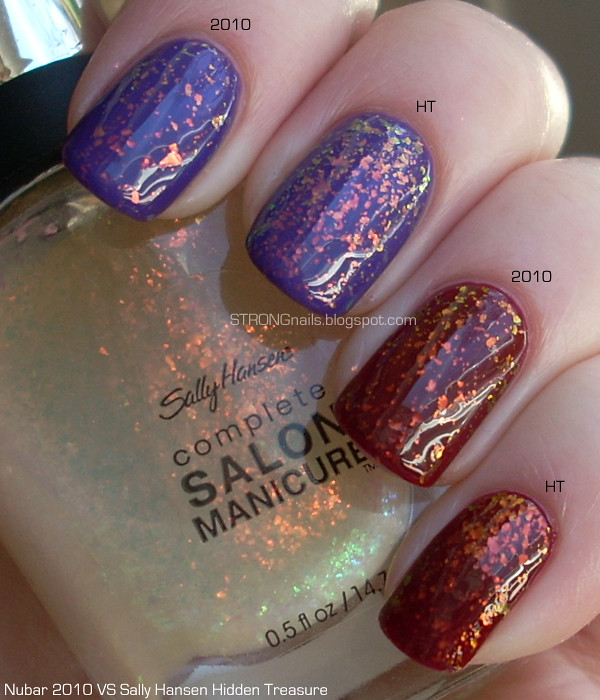
Purple: Orly Charged Up; Red: Sally Hansen Cerise Noir.
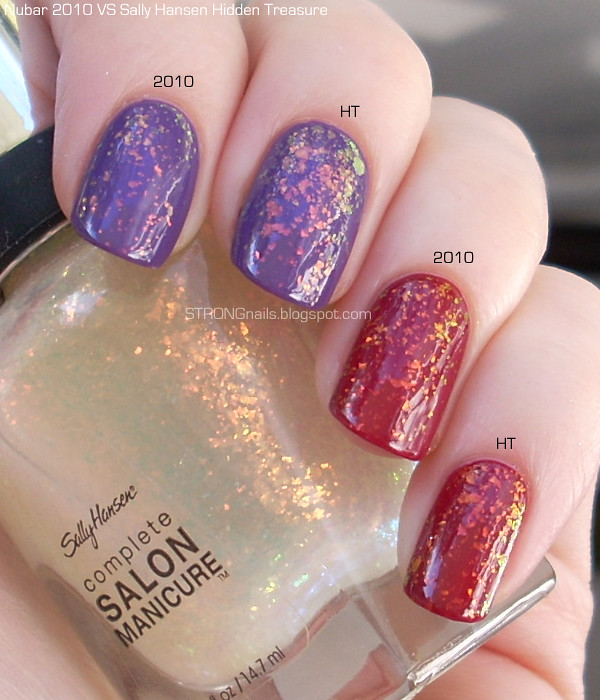
I also compared the two flakies over another pair of purple and red polishes which are slightly lighter. To be honest, I'm not really sure what my logic was at the time. How is this more helpful than the last picture? Who knows! But I might as well show you all the pictures I took in case it might be useful somehow! =)
Purple: OPI Funky Donkey; Red: OPI Manicurist of Seville.
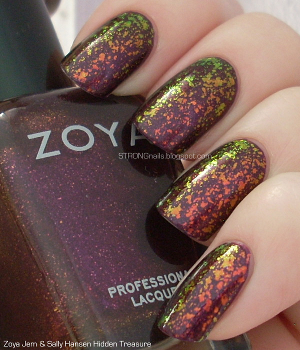
One of my first observations is that Nubar 2010 is not quite as dense as Sally Hansen Hidden Treasure. It's a very subtle difference, but still there. I'm not sure if this is because HT has more flakes packed into the formula, or if it's due to the overwhelming mop-like brush that the Complete Salon Manicure has. I definitely prefer Nubar's brush to Sally Hansen's. Aside from that, I think the two polishes are basically identical. They both seem to have the same spectrum of iridescence and react to the light in the same ways.
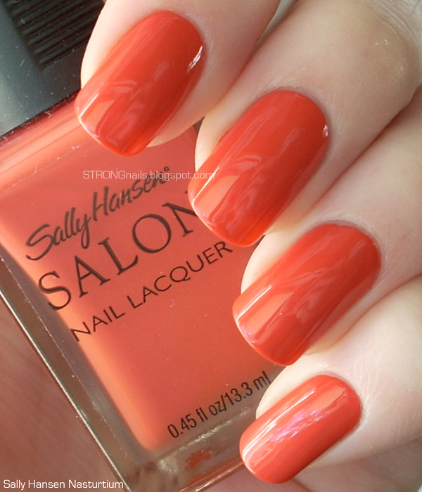
Sally Hansen Hidden Treasure was a limited edition release a couple years ago, but Nubar 2010 is available on their website for $7.50. The ease of obtaining 2010 is another point in its favor, I think!
Showing posts with label Sally Hansen. Show all posts
Tuesday, November 1, 2011
Wednesday, October 12, 2011
Sally Hansen Nasturtium
I'm back! I promise to start catching up on everything today.
This is another vintage Sally Hansen in the wonderful square bottle. Nasturtium came out with the Spring 2009 collection, but it's a color that goes well with the current New England landscape. It's an interesting shade of orange that has a suggestion of pink to it. The formula applies beautifully and was perfect in two coats.
Here's one of the great views I got to enjoy this weekend. (Click on it for the full-sized picture.)
That's a yak grazing down in the field!
Wednesday, October 5, 2011
Falling Autumn Leaves — Zoya Jem with Sally Hansen Hidden Treasure
This is a gorgeous combination. If you have Zoya Jem, I highly recommend layering a flaky polish on top. This combination makes me think of eating cider donuts and drinking hot apple cider. I took way too many pictures because it looks amazing from every angle.
Doesn't this remind you of Fall in New England?
Tuesday, October 4, 2011
Nostalgia — Sally Hansen The Good Earth
Remember the old line of Sally Hansen Salon polishes? In the spring and the fall they would come out with six colors inspired by that season's fashions. They came in these great square bottles with a rubberized cap. For some reason, I just really love the way these old square bottles look. I know I bought colors that I might not have been interested in otherwise, simply because I think polish looks so good in this kind of bottle. There's plenty of colors in the new line that I like, but I never wind up getting them because the bottles are so ugly.
The Good Earth was from the Fall 2008 collaboration with designer Tracy Reese. There were so many good colors in that collection, now I wish I'd gotten all of them. It's a rich, dark, chocolate brown with very subtle gold shimmer.
The formula is lovely. I did three coats, but you could certainly get away with just two. The brush is a traditional round brush, and much easier to use than the gigantic mops of the new line. (Did I mention how much better the old line was??) The rubbery cap is just perfect for precise control of application. Why do they always discontinue the products that were so perfect?
Subscribe to:
Posts (Atom)