Wednesday, December 21, 2011

Nails Inc. Franklin's Row — Swatches & Review

Nails Inc. Franklin's Row is another polish I got while I was in NYC earlier this month. This is my first Nails Inc. polish, and I took forever picking out which color polish I would try first. I picked this shimmery pink/purple/blue duochrome because it really stands out from the other colors in the display. It looks so gorgeous in the bottle that even though I know full well that I hardly ever actually wear anything besides cremes, I found myself bringing it up the register.

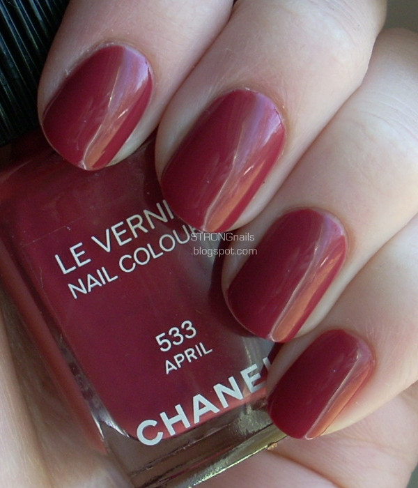
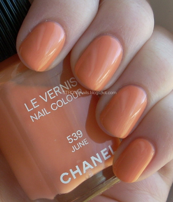
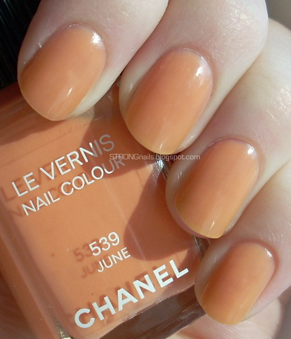
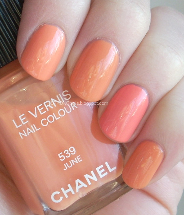
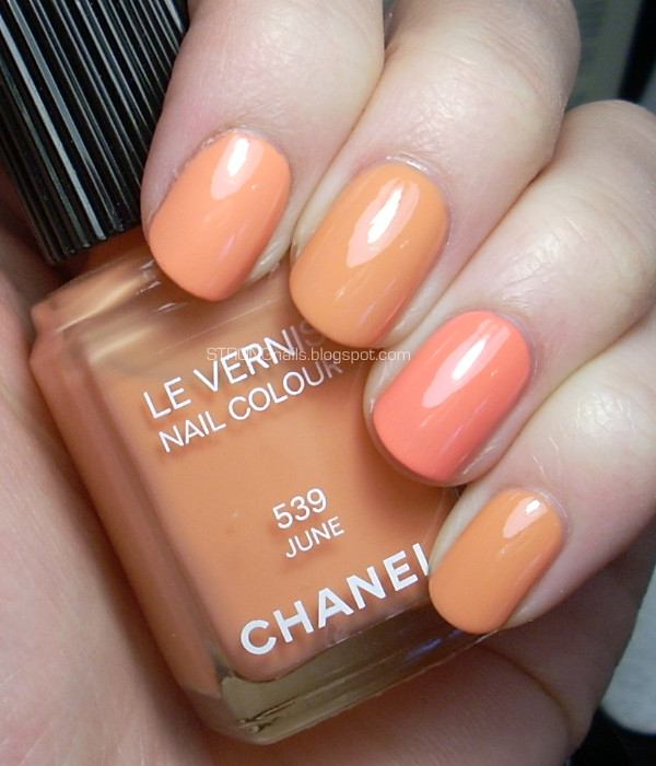
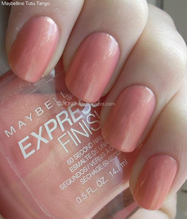
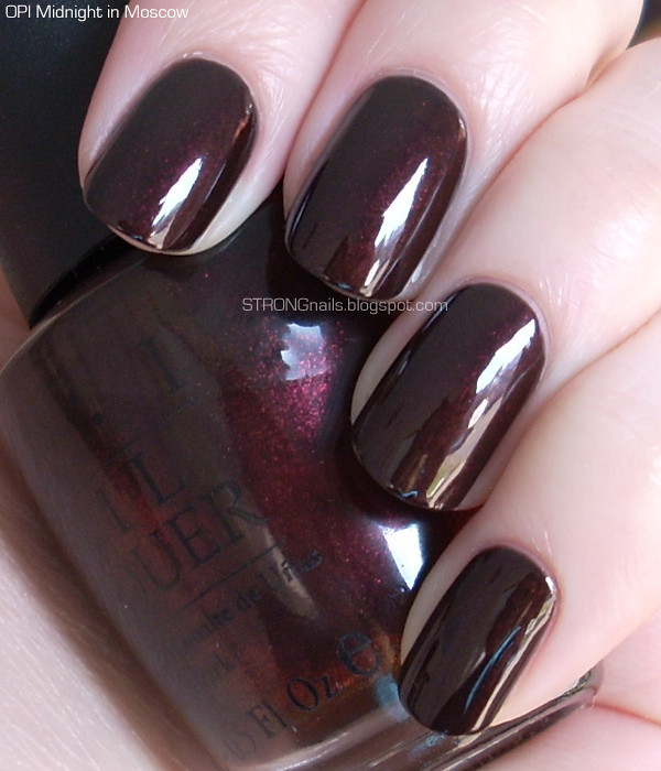
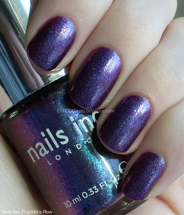
I like the Nail's Inc brush. I found it had just the right fullness and flexibility for easy polish application. I did three coats, but I probably only needed two.


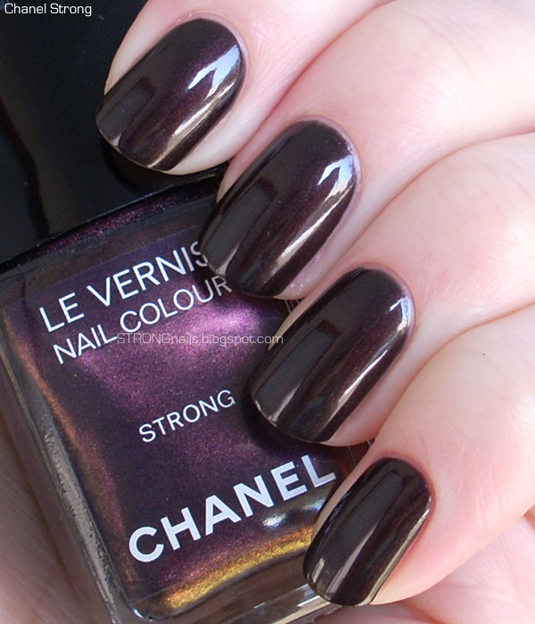
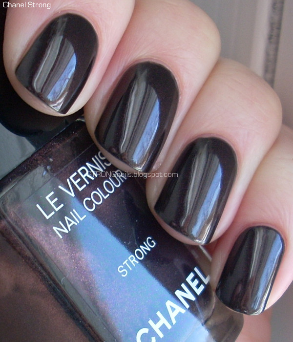
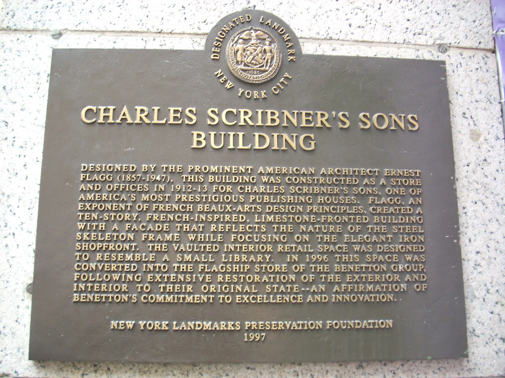
I bought this polish at the Sephora on 5th Ave between East 48th and 49th, which is just a block from Rockefeller Center. (Yes, I was indulging in typical tourist activities! Luckily it wasn't horribly crowded that afternoon.) If you're ever in the neighborhood, I recommend going shopping in this location. This was the Charles Scribner's Sons building and it's just gorgeous. Because it was designated as a landmark, the building is preserved outside and inside. The interior has a vaulted ceiling with fancy moldings and all sorts of other pretty details. If you're like me and you have a thing for interesting architecture, you'll enjoy seeing this place. Besides, it's full of so many makeup goodies. There's even a display completely dedicated to nail polish from various brands.


You can click either of these pictures for an enlarged version. Here's the plaque on the outside of the building which explains some of its history and architectural style.


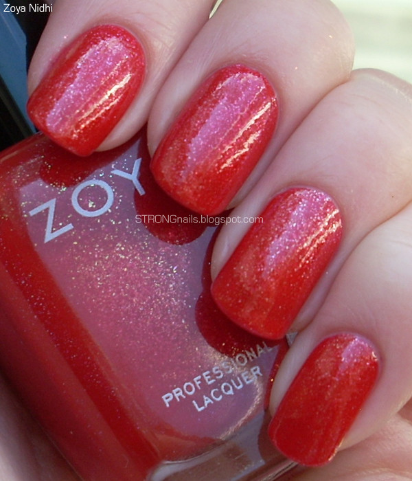
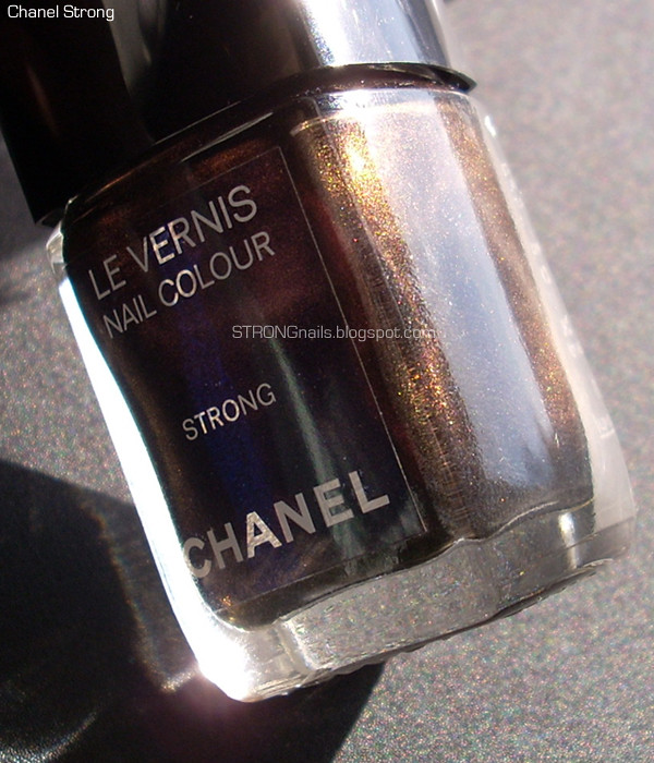
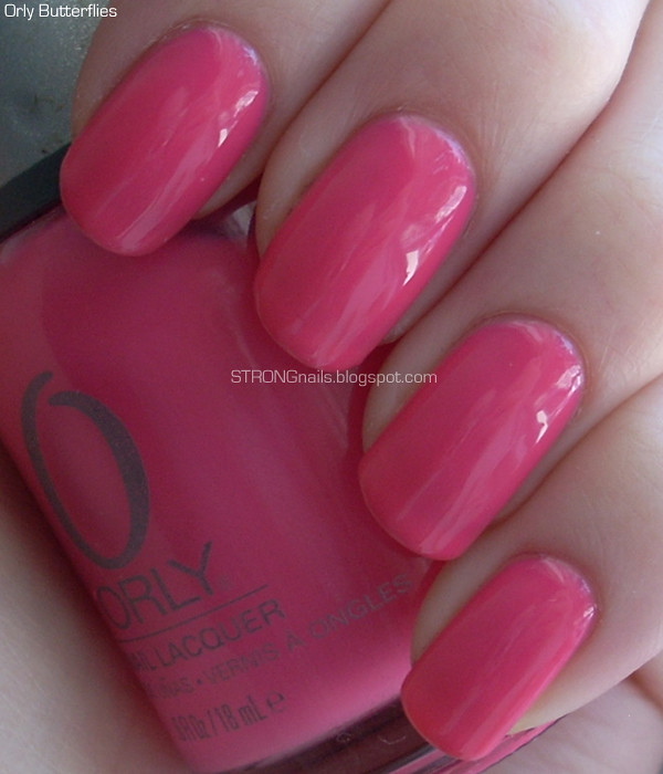
Sephora has Nails Inc. in a lot of their stores, and also on their website for $9.50. Next time I'm going to pick out a creme. Anyone have a favorite?

Monday, December 19, 2011

Chanel April — Swatches, Review & Comparison

After a few days of wearing Chanel June, I had to go back to SoHo to pick up April. Something about the color wouldn't let me stop thinking about it. (Sounds insane, but I know my fellow polish fanatics understand!) So back to the boutique I went. As soon as I painted my nails with this lovely polish, I was very glad I went back for it.

April is a soft burgundy or garnet. It has a hint of brown and is slightly muted, but still a very rich color. I think it's quite sophisticated!


This shot under artificial light shows off the slightly muted tones of the color.


I don't have a lot of colors in this family in my stash. I had nothing that looked like it would be close at all, but I made a comparison anyway in case anyone finds it helpful. On my index finger is OPI Manicurist of Seville, and on my ring finger is Zoya Sofia.


Application for this polish is so smooth and dreamy. It's seriously flawless and easy. Two coats are all I needed for saturated color and a glossy finish. I've been wearing it for four days and it's holding up beautifully with only very minimal tipwear (normal for any polish). I have a feeling this polish is going to be one of my all-time favorites.

Like May and June, April is available on Chanel's website for $25.

Sunday, December 18, 2011

Chanel June — Swatches, Review & Comparison

I'm finally back from New York City! I am not yet skilled enough at blogging to have things scheduled to post when I go away. I hope someday soon I'll get it together for that so there won't be such long pauses.

Whenever I go to New York I can't resist making a trip to the Chanel boutique in SoHo.  This time I even went twice, and the first time I came back with June (#539). June is one of the three nail colors from Chanel's Spring 2012 Harmonie de Printemps collection. In French this means Harmony of Spring, or Springtime Harmony. The three nail colors in this collection really do look harmonious together. (On my second visit to the SoHo boutique I came back with April (#533) which I will post about tomorrow.)

June is a pastel tangerine/peach/apricot color. The formula is what really makes this color so nice. It's a cross between a jelly and a creme. I used three coats for total opacity. The first time I applied this color I did a full manicure on rather long nails. It wasn't overly difficult to control the polish, but I found it easier on shorter nails. This polish has a very nice consistency and isn't streaky at all. I think Chanel did a great job on the formula for this one. It has a very nice, glossy finish.


I took a picture after just one coat to show how nicely this polish applies. You can also see the jelly-ness of it. You can also see that the color becomes more intense after two more coats.


I compared June to two polishes in my collection: China Glaze Peachy Keen and Essie Tart Deco. Obviously Peachy Keen is a much closer match than Tart Deco. Peachy Keen is definitely quite similar, but it lacks the lovely jelly texture of June. It's also streakier and chalkier, and leans a tiny bit more pink. Tart Deco of course is much pinker.


I think this shot under artificial light shows the difference between Peachy Keen and June more obviously.


I wore June as a full manicure for about four days and experienced no chipping at all. It still looked glossy and perfect.

June, along with April and May, is currently up on the Chanel website for $25. I love the convenience of shopping online, but for me half the fun is making a purchase in the boutique where you get to experience the perfect, smooth customer service.

Friday, December 9, 2011

Glitter Gradient in Festive Green

Hello everyone! Sorry about the sporadic updates; as is typical for many of us, life gets pretty busy this time of year!

Here's a manicure that I did using the quick and easy no sponge glitter gradient method. (The how-to is in this post here.) I was partly inspired by this manicure by Sharon at Polish Infatuated. I wanted to create a festive manicure that isn't too over the top, but still has a holiday feel.

I used two coats of OPI Jade Is The New Black for the base color. It's a lovely true green with smooth, easy application. Next I added Zoya Ivanka to the bottom part of the nail, trying to fade it out at the middle of the nail. Finally I topped it off with a layer of Wet n Wild The Gold & The Beautiful for a little extra golden sparkle.


Hopefully I'll have a chance to invent some more festive holiday manicures to show you this season!

Tuesday, December 6, 2011

China Glaze Prize Winning Mare

Here's a polish from China Glaze's Fall 2008 Rodeo Diva collection. Prize Winning Mare is a rich gold with a strong hint of brown.  It's got complex, multicolored shimmer.

China Glaze Prize Winning Mare

I used two coats and application was fairly easy. This collection came out around when companies had just switched over to the new B3Free formulas, and it has a little of that odd runny/thick texture, but it's easy to overcome those issues with a little extra attention and care.

Thursday, December 1, 2011

Revlon ColorBurst Lip Butter Review & Swatches

Hey, who got lipstick on my nail blog?!

I knew eventually the day would come when another type of beauty product would edge its way in here. You know how it is! I'm into nail polish, but sometimes lipstick scrambles my brain and I wind up buying it. Given how infrequently I actually wear lipstick, this happens all too often! But in this case, I'm glad because I really like the two Revlon ColorBurst Lip Butters I picked up at CVS during a BOGO 50% off sale.

This line has 20 shades all together, but there were maybe 5 left in the display. These have been getting great reviews and hype, so no wonder most of them were gone already. Luckily for me, there were still tubes of Lollipop and Candy Apple. The packaging is cheap looking but also cute and not too flimsy.


The lipstick swivels up smoothly and locks firmly in place when you swivel it back down.


Candy Apple is a bright red with orange undertones, and Lollipop is a vibrant fuchsia with a small amount of fine glitter. It's subtle and you can't see it most of the time. I swatched each color twice on the back of my hand. The upper swatch is just one swipe of the product, and the lower swatch is three. I wanted to show how pigmented both shades are even at just one swipe.


These are meant to be a cross between lipstick and lip balm, and in my opinion they succeed beautifully. I have read some mixed reviews of some of the lighter shades in this line. I think going for the more vibrant colors gave me exactly what I wanted out of these. I found the texture very smooth and easy to work with. It really does feel buttery and moisturizing, too. These are easier for me to apply these than a full blown lipstick because these glide better and the first swipe is less intense than a traditional lipstick. Because I'm a little shy about bright lip colors (but not nail colors!) I like being able to build and control how much color is on my lips. For me, this is just the right style of lipstick to help me branch out into more exciting lip colors.

These retail for about $7-$8 at drugstores and you get .09g of product. They are not limited edition, so if you missed the temporary display, no need to worry. I've been hearing they'll be integrated into the permanent display around New Year's.

Wednesday, November 30, 2011

Vintage Maybelline for Pink Wednesday!

Happy Pink Wednesday, everyone! This week's pink is an old Maybelline Express Finish polish from sometime around 2002 or 2003. It's called Tutu Tango, and from what I vaguely remember it was part of a seasonal display. This is a baby pink with lots of gold shimmer, so it becomes a very peachy pink. This is certainly the type of color a tutu might come in.


I applied two thin coats and a third thicker coat. This is an old formula polish, so it was smooth and dried quickly. The brush is really nice; it's flat but not mop-like, very similar to the L'Oréal brush.

Monday, November 28, 2011

Zoya Feel — Full Collection Review & Comparison

After spending a whole week with the Zoya Feel collection, I think I finally sorted out how I feel about it. I love it! I think this collection is excellent and I love each color in it.

Application The very first time I tried applying these colors I got a little bit frustrated. The main source of trouble was really with the brush. If I could, I would switch out the Zoya brush for something more like the L'Oréal brush. Zoya's brush is just a little too small in my opinion. It's the one thing I dislike about an otherwise fantastic brand. So there is a slight learning curve with the brush and the formula, but it didn't take too long for me to figure it out. I had basically the same application experience with all six colors.

Coats The first coat for any of the colors should be applied thinly. It will look streaky and uneven, but this will not matter after the second coat. Wait two or three minutes after the first coat so it has a chance to dry a bit. The second coat can be applied a little more thickly, and will provide opaque coverage. Use as few brush strokes as possible to get the color on, or the surface may become uneven or gooey. A little unevenness is fine because your topcoat will smooth everything out.

Drying Time I found these colors dry pretty quickly, which partly accounts for why they can get gooey if you take too long on one particular nail. I've worn Avery, Kendal and Carey as full manicures. I used Seche Vite topcoat (with CND Solar Oil a few minutes later) and all three manicures had no trouble drying.

Overall What I find so impressive about this collection is that these colors really only need two coats for even coverage. Nearly all the other pastels in my collection need at least three coats. So while these are not super easy to apply like a classic red lacquer, they are much easier than your average pastel. Give them a slightly better brush and I would call them perfect.

My two favorite colors are Kendal and Kennedy, but I think all of them are beautiful and flattering. In my opinion these shades are quite chic, too. They are really perfect for when you want something appropriately neutral but still modern and interesting.


For convenience, I've collected all the swatch pictures together after the break:

Saturday, November 26, 2011

Zoya Avery — Feel Collection Winter 2011

(UPDATE: Here's my review of the entire collection, with all the swatches together.)

At last, the final installment in the Zoya Feel Collection! Here is Avery, a pale camel creme. Unexpectedly, I found this color was the easiest to apply out of the whole collection. It was thin but not watery, and flowed well. I used two coats and no topcoat for this swatch. It also dries fairly quickly and is shiny. Tomorrow I'll have a full collection comparison and review post!


Thursday, November 24, 2011

Zoya Kennedy — Feel Collection Winter 2011

(UPDATE: Here's my review of the entire collection, with all the swatches together.)

Happy Thanksgiving!

I have just a couple minutes before I have to run off to visit family for the day's fun! Here's Zoya Kennedy from the Feel collection. It's a dusty pastel rose, and is vying with Kendal for the spot as my favorite shade from this collection.


Application was like the rest, slightly tricky but smooth considering it's a pastel. Two coats and no topcoat in this picture.

Wednesday, November 23, 2011

Zoya Kendal — Feel Collection Winter 2011

(UPDATE: Here's my review of the entire collection, with all the swatches together.)

Do you think Zoya Kendal might be pink enough to qualify for Pink Wednesday? I can't decide if this pastel creme leans more lavender than pink. Next to Megan, it's definitely a shade pinker.


This is probably my favorite color from the collection. I thought the application was a tiny bit easier than the first four. Once again, it only needs two coats and the final result is smooth and shiny with no streaks or unevenness.

Tuesday, November 22, 2011

Zoya Megan — Feel Collection Winter 2011

(UPDATE: Here's my review of the entire collection, with all the swatches together.)

Hey there! Continuing with the Feel Collection, here's Zoya Megan. I'm finding this color tough to describe. It's very delicate, light gray with a hint of lavender. (I guess I just described it!)


Like the other polishes in this collection, Megan needs two coats for opacity. I recommend same technique of one thin coat and a second thicker coat for applying this color. Even though these pastels can be a little annoying and thick, I'm becoming more and more impressed with this collection because despite any application issues, you really can get this polish right in two coats. If you have any leftover lumpiness, the topcoat will smooth everything out.

Monday, November 21, 2011

Zoya Carey — Feel Collection Winter 2011

(UPDATE: Here's my review of the entire collection, with all the swatches together.)

Here's the next color from the Zoya Feel Collection, a pale gray creme called Carey. This is a fairly neutral gray, although I would say it leans a tiny bit to the cool side.


Like Kristen, this polish only needs two coats for complete opacity. Since it's a pale color, the formula is a little tricky to work with. I found it was best to make the first coat thin, and to not worry about how streaky the coverage was. Wait at least two minutes, then make the second coat a little thicker. It also helps to apply the color in as few brush strokes as possible.

Sunday, November 20, 2011

Zoya Kristen — Feel Collection Winter 2011

(UPDATE: Here's my review of the entire collection, with all the swatches together.)

I got the Feel collection in the mail yesterday. I rarely buy full collections, but I was totally drawn into this one by the promo picture. I do not regret my purchase, each color is lovely! First I'll show you Zoya Kristen, which is a slightly blue-tinged pale gray creme.


The formula for this color, and this whole collection, is simultaneously impressive and frustrating. I'm super impressed that it only took two coats to get full coverage and opacity. This is pretty rare for such pale colors. The texture is chalky and tricky to work with, but still a major improvement over pastel colors that came out a couple years ago. Only two coats! I don't think I've ever encountered a pastel that worked in less than three coats before. So that's a big plus.

The first time I applied this color, I found it irritating and difficult to keep the surface smooth. I decided to try again a few hours later, and for whatever reason it seemed pretty easy that time. The first time I applied this color the brush seemed so small and skinny, and I couldn't for the life of me find the wider side of it. The second time the brush still seemed too small but I was able to make it fan out better. I think most of the application issues would be easily solved by Zoya adopting a nicer brush. If it just had a few more bristles, and was a tiny bit flatter, I think I would love the brand even more.

Saturday, November 19, 2011

OPI Ski Teal We Drop

Hello everyone! I'm sorry about the long absence. I went out of town and also came down with a cold, so I have been terribly neglectful of my blog. I got some good nail polish mail today, though! The Zoya Feel collection arrived, so I hope to be posting swatches and reviews of those color soon.

OPI Ski Teal We Drop came out with the Fall 2010 Swiss Collection. It's a lovely saturated teal creme. The second picture looks most color accurate on my monitor.


I only needed two coats for perfect, smooth opacity. The formula is pretty easy to work with, although it can sometimes feel a tiny bit thick. I have a dense wool sweater that's almost this exact color, so to me this shade fits right in with the whole snowy, Swiss, skiing concept.

Friday, November 11, 2011

How To Do A Simple Glitter Gradient Manicure — No Sponges Necessary!

Lately I've really gotten into browsing Pinterest. It's a cool way to discover beautiful, interesting things. There are plenty of fellow nail fanatics on there, and I'm having fun finding them and following their pin boards. This manicure was inspired by all the glittery manicures people have been pinning up on Pinterest.


This is a manicure that looks fancy but is super easy to do:

 — Paint the base color. (After your base coat, of course!)
Use any color you like. I painted my nails with four coats of OPI I'll Take The Cake. It's a sheer pink with very fine multicolor shimmer. Four coats seems like a lot, but this polish goes on so smoothly it was no trouble.

— Let it dry.
It doesn't need to be completely dry, just let it dry for a few minutes. You want the base color to stay in place without wrinkling when you add the glitter.

— Add the glitter.
Use any color glitter polish you like. I used Wet n Wild The Gold & The Beautiful. It's glitter in a clear base, which made it perfect for this technique.
- dab a small to medium drop of glitter at the base of the nail.
- wipe the rest of the polish off the brush and back into the bottle.
- lightly drag the drop of glitter outward in small, short strokes.
- fade the glitter by making short strokes starting partway up your nail. This will drag some glitter particles to the middle of your nail, but will not catch too many by taking glitter from the densest part at the base of the nail.

— Finish the manicure.
All you need now is a quick drying topcoat and some cuticle oil!


Here's what I'll Take The Cake looks like on its own, for good measure:


I hope my instructions made sense. Tell me if anything needs clarifying! What color combinations would you try? I want to try taupe with silver glitter, but I have to buy some silver glitter polish first!

Wednesday, November 9, 2011

OPI Midnight In Moscow

One of my favorite super dramatic vampy nail polishes is OPI Midnight In Moscow. This is another one from the Russian Collection that came out in Fall 2007. It's a deep charcoal with red shimmer. In low lighting it's velvety and almost black, but in the sun it has this glowing, smoldering look.


The formula is great, it's neither thick nor runny. I needed just two coats for opacity. These pictures are without topcoat, and you can see even on its own the polish is quite glossy.

Saturday, November 5, 2011

Zoya Nidhi

My manicure today is Zoya Nidhi from the Sparkle Collection. It's a bright, apple-y red with gold and pink/blue iridescent sparkling flecks. A number of people noticed and complimented me on this color, so it's bright and sparkly enough to catch some attention.


Application is quick and easy. It needs just two coats for opacity, and each coat went on perfectly and dried rapidly. I know sometimes people have trouble with Zoya polishes drying super slowly, but I don't think this is one that will give anyone problems. Even though this came out as part of a summer collection, I think it's a very festive and Holiday appropriate red. In fact, I may try combining it with Zoya Ivanka (the sparkling green from the same collection) a little later in the season.

Thursday, November 3, 2011

Chanel Strong — SoHo Story 2010

I admit, I bought this polish for the name. I couldn't help it! And it seems only appropriate to feature it on this blog. Chanel Strong came out last fall when the SoHo boutique had just been remodeled. This was part of a special makeup collection that tied into that store. I've been to that particular boutique a couple of times (most recently to buy Blue Rebel) and each time I have received excellent customer service. Sometimes high end designer boutiques can be intimidating, but the SoHo Chanel is completely delightful. The clerks are very friendly and nobody looked at me funny for clomping in there wearing my tennis shoes and band t-shirt. So if you're in lower Manhattan and you're in the mood for some Chanel, don't hesitate to stop by the corner of Spring and Wooster.


The polish looks more exciting in the bottle than on the nail. In most lighting conditions it appears almost black. But if you look closely, you can detect the plummy shimmer. To me it has a very velvety appearance, even if it is very dark. The application is a dream. It's nearly perfect in one coat, but I prefer to do two thin coats. The formula is thick but not hard to work with. The viscosity makes it incredibly easy to control where the polish goes, and avoid the cuticles.

Wednesday, November 2, 2011

Orly Butterflies for Pink Wednesday

Happy Pink Wednesday, everyone! This week I have the classic pink jelly Orly Butterflies. It's not quite a neon, but it's very bright and it does have a certain almost neon glow in the sunlight. The second picture best represents what it looks like under most lighting circumstances.


This polish is a cinch to apply. You need three coats for opacity, but I had no trouble with cuticle drag or evenness. It has a squishy translucence. I still had a slightly visible nail line after three coats, but that's what makes it a juicy jelly.